Creating the app Planeatary for a sustainable and healthy diet in everyday life
Planeatary is a mobile app designing to support users to follow a healthy and environmentally friendly diet.
UX Design
FrontEnd Development
Mobile


Analysis of the usability of cookie notices via an eye tracking research as part of my bachelor thesis at University of Hamburg. In particular, I compared four common types of cookie notices on the basis of various eye tracking metrics and the answers to a questionnaire in a research with 30 participants. Additionally, I created a wireframe of a user-friendly cookie notice based on the findings.
Professor: Prof. Dr. Walid Maalej
Supervisor: Abir Bouraffa
November 2019 ➙ September 2020
Nowadays nearly every website provides cookie notices. This is a legal obligation and not well received by a lot of website owners. But what about the website users point of view? In 2020, I tested the usability of four common cookie notices in a study, using eye tracking and questionnaires, as part of my bachelor thesis. And in this article, I will give you a summary of what I did and what my findings where. Additionally, I created a prototype for a more user-friendly cookie notice and give some general tips on their design.

After the implementation of the GDPR in May 2018, the number of cookie notices on the 500 most visited websites in the EU member states increased to 62%. To facilitate my analysis and research, I extracted the six cookie notice categories from the paper titled "We Value Your Privacy… Now Take Some Cookies: Measuring the GDPR’s Impact on Web Privacy" by Degeling et al. I then streamlined them into five distinct types, categorized by the variety of interaction options they offer:


I did an analysis of a random sample of 100 websites from the “Top Sites in Germany” listing by Alexa (500 most visited websites in Germany):

The most used types of cookie notices were Confirmation (43 notices) and No Option (15 notices). 5 notices were Binary and 1 offered a choice of Categories. None of the notices did provide a choice of Vendor.
In 18 of the notices, another cookie setting was “hidden”. For example, by clicking on a button or link, a popup with further setting options appears or the notice enlarges and thus offers more options. 12 of these hidden interaction possibilities offered a choice of cookie categories. 2 could be assigned to the category Vendor and 4 of the notices offered both a choice of categories and a choice of vendors.


I also examined the cookie notices for the use of dark patterns. One or more types of nudging (Design elements that influence the behavior of the user) were applied to 21 notices. And 22 notices used the Auto Accept mechanism, where the notice is automatically accepted if the user interacts with the website or after a certain amount of time.
Additionally, I analyzed the position, size and content of cookie notices but this would get a little too far in this article and isn’t relevant for the eye tracking study I conducted.
I examined and compared the usability of four different kinds of cookie notices in an eye tracking research. I did consider cookie notices as a part of the webpage and therefore as part of the overall user experience. Users enter a website with a specific goal, for example, to search for information. A cookie notice could be a distraction from this goal and therefore affect the user experience of the website and the overall satisfaction of the user.

To analyze the usability of different cookie notices, I considered the following research questions:
The questions were chosen to cover the three most important aspects of user experience: the effectivity, efficiency, and satisfaction of achieving the goal.
The study was carried out in a special eye tracking laboratory for usability testing using a Tobii X2–60 compact eye tracker. In order to avoid priming effects, I have found it necessary to tell the participants a cover story. So, the participants believed that they were participating in a usability study about their search behavior on websites.
I structured the study in two parts: the eye tracking and the filling out of questionnaires on demographics and cookie notices. In the eye tracking part the participants were sequentially shown four different fictional websites. Their task was to search for a specific information on each website. Each participant saw four different cookie notices of the following categories: Confirmation, Binary, Category and Vendor — I skipped “No Option” because this notice doesn’t align with the GDPR. The order of the cookie notices and on which website they appeared was randomized via latin square.

There where 2 different groups of participants: the first group had as much time as they chose to search for information. The second group had a time limit of 15 seconds per website (which they knew beforehand). This was intended to represent different everyday situations: searching for information under time pressure, e.g. when looking for a quick answer to an urgent question, and more in-depth examination, e.g. when researching a specific topic.
Of the 30 participants that took part in the study, 50% were male, 50% female. On average, participants were 28 years old, the youngest being 16 and the oldest 60 years old. To keep this article a little shorter I will skip the participants employment status and the data on their internet usage and former knowledge on privacy and cookie notices.
To evaluate the eye tracking, I created different metrics that can be assigned to the three research questions. For this I used Areas of Interest defined in the Tobii Studio software.

Areas of interest (on the original cookie notices used in the research in german) - Blue: whole cookie notice, Green: Text, Red: Categories/ Third Party vendors, Yellow: Accept button, Purple: Decline button
How intensively does the user engage with the cookie notice?
To get an answer on this research question, I used the number of fixations (= sum of fixations on the cookie notice in total) and total fixation duration (= total duration of these fixations).
To what extent does the cookie notice fulfill its goal of informing the user?
For this research question, I used the information fixation duration, which is the duration of fixations on the text and, in the case of the category- or vendor-specific notice, the checkboxes.
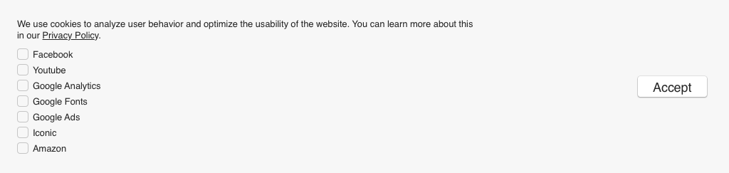
All cookie notices presented in the study contained the same text: “We use cookies to analyze user behavior and optimize the usability of the website. You can learn more about this in our Privacy Policy.” (translated to english — the study was conducted in German)
How long does it take the user to make their decision?
The metric I used for this research question is the time of decision making. I calculated this metric by subtracting the time of the first fixation on the cookie notice from the time when a button was clicked (and therefore the cookie notice closed).
After the eye tracking part the participants took a questionnaire on the different cookie notices they saw during the tasks. The questionnaire contained quantitative (5 point likert scales) and qualitative (textfields) questions. The quantitative questions asked for the understandability of the different cookie notices, the difficulty of decision making and the satisfaction with the choice options. I will list some of the results below in the summary of the study’s findings.
For the evaluation of the qualitative questions I grouped similar responses in categories. I will only name the categories that were mentioned by at least 4 participants.
»Because [. . . ] it is often hardly possible to refuse cookies or it’s made extremely difficult.«
I defined the optimal cookie notice by enabling the user to make an informed decision without distracting them from their actual goal. Therefore, the best usability is offered by notices that are in the midfield for all metrics.
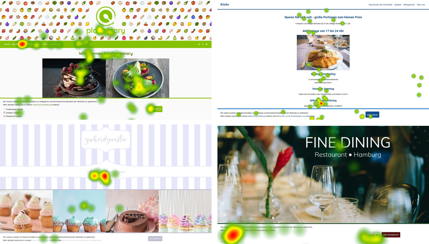
Example Heat Maps for different websites and cookie notices
Across all metrics of eye tracking, an upward trend is evident in the mean values (from Confirmation to Binary to Category to Vendor). The vendor-specific notice was fixated on more frequently and for a longer period of time and used more for information purposes than the other notices and it took the longest time to make a decision. This means that users tend to deal more intensively with notices, the more decision-making options they offer. But cookie notices with which users are particularly intensively occupied can distract them from their actual goal on the website. This is also evident from the fact that 70% of the participants stated in the questionnaire that the number of choices in the vendor-specific note was too large or far too large, whereas 60% found the number of choices in the notice with the fewest interaction options, the Confirmation notice, too small or far too small. The best performer in terms of subjective assessment of the number of choices was the Binary notice, where 77% of the participants found the number of choices to be just right.
Although 73% of the participants stated that data protection on the internet was important or very important to them, only one of the notices was read by a participant and only a few participants skimmed the notices. These results show that it must be questioned whether cookie notices are generally suitable for their purpose of informing users.
On average, users paid attention to the Confirmation notice for only 0.6 seconds, to the Binary notice for 0.9 seconds, to the category-specific notice for 1.4 seconds, and 2.1 seconds to the vendor-specific notice. Whether these times are sufficient to make an informed decision is open to question. However, it is thinkable that users have already informed themselves about cookies and data protection in advance and make their decision based on this knowledge. This can be derived from the fact that 22 of the 30 participants in the questionnaire stated that they had already dealt with data protection on the internet to a great or very great extent. This indicates that the cookie notice is not an information medium for users, but rather a decision-making tool. However, it is striking that many users did not make an active decision, but ignored the notice, even if they had had the opportunity to make an actual decision between different choices.
Across all three research questions, it was shown that users spend significantly more time on the notice when they are not under time pressure. This should be taken into account when considering a user-friendly cookie notice, as users should also be able to make a decision about their data in situations where they are under time pressure.
The following tips are based on my study and various other scientific papers I found in my research:
Finally, I designed a user-friendly cookie notice — however, further research is needed to further optimize the usability of cookie notices. The following prototype is only a first draft and it would be necessary to evaluate the prototype in a usability test.
My prototype is a hybrid of the two cookie notices that scored best in my study. Initially it is based on the binary notice of the study, but by clicking on “Configure Cookies” the notice unfolds and offers a selection via categories. The cookie notice is intended to provide a good user experience for two different user groups and different everyday situations. A study (by Utz et al.) found that most website visitors make a binary decision even when they have more than just two decision options available to them and only few users select a specific category. The notice covers both behaviors by initially providing a highly visible binary decision. However, the users who would like to make a specific configuration are also included, as they gain more control through the configure function.
The text is identical in both states and was kept short because most users do not read it. To make it easier to skim, the cookie notice is titled with “Data protection” and I structured the text in bullet points with supportive icons. The title is also intended to make it clearer, that the cookie notice has nothing to do with the websites technical functionality, but only with the protection of the user’s data. The icons and text are to be adapted for the respective cookie use of the website.
In the configuration state, I skipped “functional cookies” to avoid confusion because they are always mandatory and don’t have anything to do with data protection since they are necessary to run a website. Next to the listed cookie types are little “?”-icons that should provide information about this type on hover. The exact categories and their explanations must be adapted to the website where it is used.
The buttons are replaced by a “Ok” button in the configuration state. I chose the label “Ok” because it is clearly distinguishable from “Accept” or “Reject” and to make it clear that the selection made in the checkboxes is confirmed.
In order to keep the notice as simple as possible to use, I omitted a way to return from the configuration state to the initial state. Both a “Reject” and an “Accept” can be generated in the configuration states with a few clicks by making selections in the checkboxes.

Planeatary is a mobile app designing to support users to follow a healthy and environmentally friendly diet.

The User Insights Knowledge Base project tackles the challenges of limited user contact and knowledge sharing at Digitec GmbH.
Get in touch for opportunities or just to say hi!