The usability of Cookie Notices — Eye-tracking study
Conducting an eye-tracking study to investigate the usability of common types of cookie notices, and designed a prototype for better usability.
User Research
Web


Planeatary is a mobile app designed to support users to follow a healthy and environmentally friendly diet in their everyday life. The app implements the Planetary Health Diet, which is based on the findings of “The EAT-Lancet Commission on Food, Planet, Health”. I created it in collaboration with Designer and Developer Torben Ratzlaff.
Goal: Making the scientific findings accessible for everyday use across country boarders and cultural differences.
March 2019 ➙ January 2021
A few years ago the “Planetary Health Diet”, which is supposed to be both healthy for humans and sustainable for the planet, went through the media quite a lot. My friend Torben Ratzlaff and I both found the diet exciting but were disappointed by the fact that in the end, no one was following it. Here we saw an opportunity for good design and technology: the diet in its scientific form with grams of certain food categories was not made for everyday use. Together we planned, designed, and developed the app “Planeatary” — based on the scientific Planetary Health Diet by EAT-Lancet Commission on Food, Planet, Health — as a project in our free time.
»The app Planeatary illustrates how design can build a bridge between science and everyday life.«
While creating Planeatary Torben and I spent a lot of time in fancy Cafes in Hamburg and talked about all the details. The first thing we did was read the scientific paper called “Food in the Anthropocene: the EAT-Lancet Commission on healthy diets from sustainable food systems”. The result of this paper is the Planetary Health Diet, but it also gives a lot of details into why this is a healthy and sustainable diet.

As you can see in the graphic above, the Planetary Health Diet is structured in food categories like vegetables, milk, grains, etc. Each category has an amount of how many grams per day an adult person with a calorie requirement of 2500 kcal is “allowed” to consume.
This diet plan is all we had in the beginning — and you might easily see the opportunity we saw in this: the diet is a great idea in general but tell someone to eat 7g of pork, 13g of eggs, and 50g potatoes a day and they will call you insane. These grams only make sense 1. over a longer period of time and 2. most people don’t know how many grams of something they eat. For example, a hen’s egg has an average of 52g, so according to the diet plan with 13g of egg per day, one egg could be eaten every 4 days. Of course, it becomes more complicated if the egg is not consumed “plain”, but is contained in a food, e.g. in a cake. This is where our idea for Planeatary comes in: an app that tells you what to eat for a healthy and sustainable diet, based on what you’ve eaten before.
Of course, before we went deeper, we thought about who would use Planeatary. To consider possible users in the further design of the app, we not only integrated the most likely users but also some edge groups. The personas we created are mostly from our imagination, therefore they are Proto Personas. Throughout the design process, we also talked a lot with friends and casual acquaintances about our app, so we kept getting feedback.

After reading the paper, our fingers were itching to get started with actual work. Before we could even think about programming or the interface, one thing was clear: we would need a lot of data for this project and most of it would have to come from us. So we wanted to start collecting data sooner rather than later.
Conceptually, it was clear to us early on that we needed to track what users ate so that we could then use the science to make predictions for the future. In addition, the food categories would not be sufficient for us — who can say “I ate 43g of legumes today” — instead, we rely on individual foods that are part of the categories, such as lentils instead of legumes or apples instead of fruit. We were also very sure that our users would not be willing to weigh all their food and therefore other units are needed such as “one piece” (apple, cucumber, egg …), “one spoon” or milliliters.
The next thing we did was probably the most techy/ engineering thing you could do this early on: we created a data model on which the app would be based.

And then we created a big Excel spreadsheet for the specific data point “food”. There, we collected all the basic foods we could think of and then added them to categories — which wasn’t so easy in some places, e.g. is a coconut a nut or a fruit? Over the next while, we both spent a lot of time in supermarkets — weighing fruits and vegetables. And at home, the scale became our best friend: how much does a slice of bread weigh? Or a tablespoon of olive oil? In the beginning, we were very open with units and had, for example, the unit “clove” only for garlic. Later, we unified it more and created more general categories like one “part” of garlic.
Later in the process, we also added two additional food categories beyond the Planetary Health Diet: Salt and Alcohol. For salt, we found another scientific basis — 3g per day at the default of 2500 kcal. For alcohol, 0g is always displayed in the app, we just added this because alcoholic drinks sometimes contain foods from other categories e.g. sugar, and also have many calories, and some users might use Planeatary for calorie tracking.
Before we started working on our user interface, we did a competitor analysis. I mostly had a look at the app Yazio, which is a well-known diet app. The data model of the diet is different from ours but a lot of basic mechanisms are the same — you have to add consumed food and then the app will tell you what to eat, count calories, …
There was also another app that dealt with the Planetary Health Diet but did not implement the concept well in our opinion. Torben examined another dieting app and we superficially looked at a few more apps that had minor similarities with our idea, e.g. the app “Water Balance”, where you can track your daily water needs.
We started by thinking about a general concept of how to organize the screens: which screens do we need and how are they connected? After some iteration, we agreed that there should be two primary screens: 1. a screen that shows the already eaten food in some calendrical form and 2. a screen where all food is visible and the amounts that can still be eaten. In our first paper sketches, we focused primarily on these screens and the “adding” of a meal — that is, the transition from the screen with the food that can still be eaten to what has been eaten.

After sketching on paper for a while we switched to a more final design using Figma. We did the whole design in German because the language has much longer words than English and therefore is good to better estimate the space in multilingual apps — and we wanted to at least have a German and an English version.

Next to the already described screens that were already sketched on paper, we added another screen that is supposed to be a more general overview or statistic. On this screen the food categories are listed and how good the user's diet is in that category in retrospect for today, a month, a year, and all the time.
The icon library as well as the biggest part of the UI design was done by Torben — who is a designer and developer, while I mainly specialize in UX design.
After we were satisfied with the final prototype, we started development. For this, we used the cross-platform Apache Cordova, which allows you to program apps with HTML, CSS, and JavaScript that can be run on both Android and iOS. The more complicated development was primarily done by Torben — I did some of the CSS and HTML.
Even though the basic concept was already in place, we quickly (mostly on the fly while programming) realized that we would need additional features to achieve our goal — to make the diet accessible in everyday life.
With the first beta version of Planeatary, which already included a lot of different foods and (a first version of) all the features we wanted to integrate in the first release, we did a usability test. 7 participants (originally 19 participants were registered, but we have received feedback from only 7) tested the app on a variety of different phones for a few weeks and then filled out a survey. Some participants had seen or used the app before — as Torben and I kept asking for feedback throughout the process — but most of them had never used the app before. We asked questions like: “What technical or content-related errors did you notice?” “How regularly did you use Planeatary?” or “How hard was it for you to enter your food consumption?”. Some questions came with 5-point Likert scales, others with text fields. As a result, we got a lot of valuable feedback on the positive and negative aspects of the concept and the usability. Here are a few quotes:
»A larger selection of already saved foods would be nice. I could not add new basic ingredients (like vegetables/fruits).«
»The app is very easy to use and the existing functions are self-explanatory.«
»Relatively time-consuming for daily use.«
Some of the problems we encountered are: “missing food data” which makes it more difficult to use the app, a complicated interface to enter your own dishes, or problems finding food. Also, the general way “sustainability” is understood by the Planetary Health Diet was partly not understood, so the app could not confirm some assumptions of the users like “the CO2 footprint of the food is missing”.
After conducting the usability test, we made a few changes based on the results:
We did release the first version of Planeatary in January 2021 in the App Store and Google Playstore. If you want to test it, it is still available in both stores — you can also find our website here. Last but not least I want to give you some impressions in the form of screenshots of how the final app looks — but of course, you will have the best experience by downloading it.
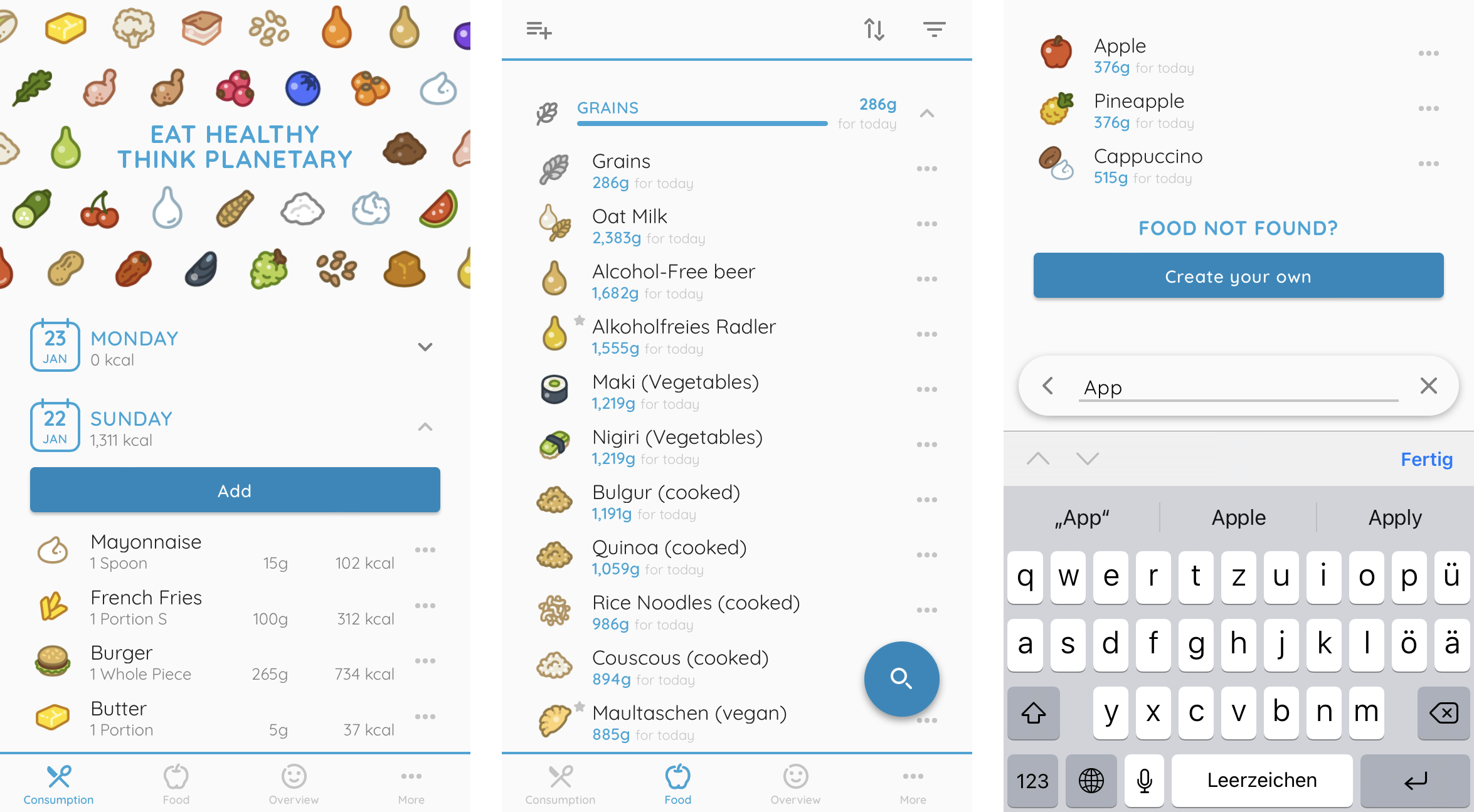
The screen shows the consumed food and the list of foods, as well as the search functionality.
The “Consumption” screen shows the consumed food sorted by dates. If a user doesnʼt type in any food by the end of the day, the app will automatically apply a “perfect” diet plan so that there isnʼt a calorie lack in the statistics and the amount that can be eaten the next day gets smaller. In this screen, the user can go into the past as far as they want, but after a certain amount of time (several months) the days will get summarized and only the basic food categories will be displayed for a whole month - this helps to not overcrowd the interface and since the data is saved locally on the userʼs device, the file doesnʼt get too big.
The “Food” screen shows the list of all the foods, divided into the food categories (default). For every category, the remaining amount that can be eaten on this day is displayed in grams and with a graphical bar. The specific amount is also displayed for every food - since foods can consist of different categories or include water, the amount often varies from the category. In the screenshot e.g. “Oat milk” is visible shows 2,383g while the grains category has only 286g left, this is because oat milk mostly consists of water and does not need that much grain in production.
The screen also includes functionality like filters and sorting, adding custom foods (see below), and the search functionality.

Creation of a custom food and adding a consumed food.
One feature of the app is to allow the creation of custom foods since a 100% database coverage of all food is not possible. The feature can be accessed through the bar in the “Food” screen (top left) or if a food is searched and not found. There are three different categories of custom food: “Staple food” (= consists of the basic food categories, e.g. exotic fruit), “Packaged food” (e.g. your favorite candy that has an ingredient list in %), “Prepared dish” (e.g. a recipe you cook).
The screen to create the custom food varies a little based on the category of custom food, in any case, a name, description, and icon can be assigned, the food consists of ingredients and units can be added. For Staple foods only the basic categories can be added in percent and the calories per 100g can either be added or calculated by the app based on the underlying categories. For Packaged foods any food or food category can be added as an ingredient in percent and the calories per 100g can either be added or calculated by the app based on the ingredients. For Prepared dishes the ingredients are added in gram or their units (e.g. “1 piece”) and the calories per 100g are automatically calculated by the app and canʼt be changed.
The screen to the right shows the popup to add consumed food. With this popup, it is transitioned to the “Consumption” screen. The date is per default today or the last date where a user did hit “Add” in the “Consumption” screen (therefore it is possible to add food to past dates). The popup is accessible by clicking on any food in the “Food” screen (also through the search functionality). Per default “Grams” is selected as a unit. If the unit is changed the default amount switches to “1” if it was “100” before. The app remembers the last unit that was selected for every food to make it easier to add the foods to the consumption, e.g. if you eat 2 apples every morning you can just click on “Apple” and the app will have “2 Whole Pieces” remembered from yesterday.
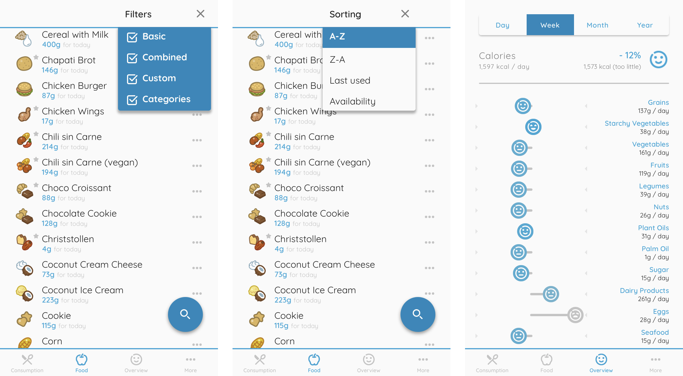
Different mechanisms to sort and filter the foods and the overview screen with statistics per category.
The app provides different Filters to filter the long list of foods in the “Food” screen. The filters are “Basic” foods (= including only one food category, e.g. Apple, Flour, Milk), “Combined” foods (= consisting of different foods or food categories, e.g. Pizza, Cookie, Mayonnaise), “Custom” foods (= created by the user, they are also marked by a small star in the UI), “Categories” (= the foods are per default ordered by their categories, these can be hidden via the filter). Per default every food and category is visible.
Additionally, there are different sorting mechanisms: alphabetical A-Z (default), alphabetical Z-A, Last used and Availability (= descending number of grams that can still be consumed). If the categories are visible the sorting happens for the foods inside each food category and doesnʼt apply to the categories themselves.
The “Overview” screen shows different statistics on how well the Planetary Health Diet is implemented by the user (in the past). The top shows the calories per day and how it is matching the set daily calories. Underneath it is a graphic for the food categories. The graph has a two-dimensional scale, where the left is too little and the right is too much. The more the smiley is in the middle, the happier it is, because in the middle the plan is followed (too little or too much of a food in a food category is in most cases unhealthy and/ or unsustainable for the planet). The text underneath the food category name switches between the average amount per day and a number of how many grams and percent too little or too much it is e.g. “-179g, -14%”. If the deviation is not significant, the app shows the text “optimal” instead. This statistic can be seen per day, week, month, or year.
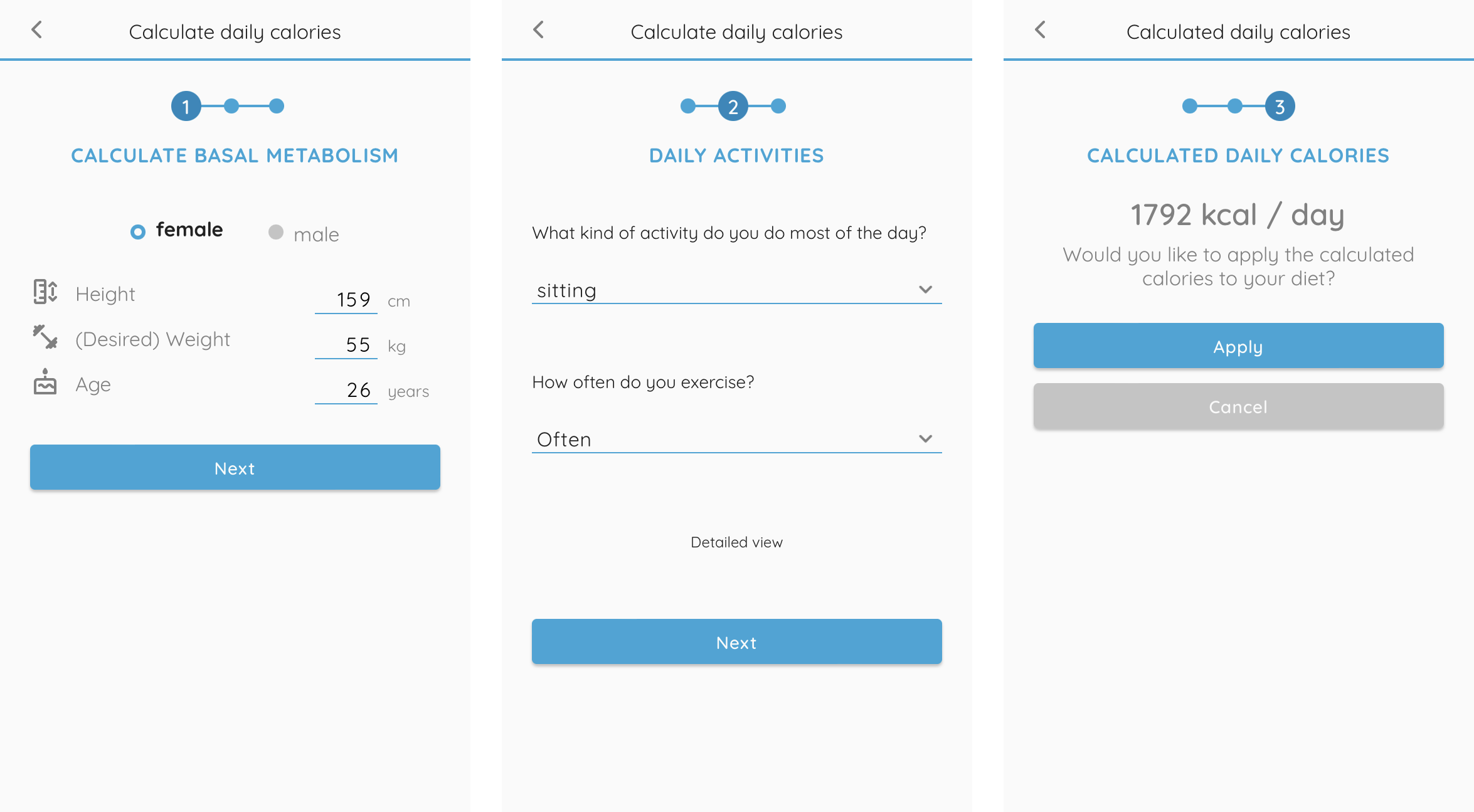
The three steps of calculating the daily calories.
We worked quite a lot on the calculation of the daily calories. In the first screen the basal metabolism is calculated — how many calories are needed with no activity. For the “daily activities”, the user can either use this easy version shown in the screenshot or a more detailed view where the average activities per hour of the day can be filled in e.g. 8h sleeping, 8h sitting, 2h walking, 1h exercise, … The latter is the scientific approach we found in calculating the calories. But our tests and our gut feeling showed us that it is hard for users to estimate these average activities and it takes quite long. We therefore developed and tested the easier version with just 2 simple questions and found out that it reliably showed very similar results to the more detailed approach.
The daily calories, as well as the diet plan (omnivore, vegetarian, pescetarian, vegan, or custom), can be set in the “More” screen. There are also a few other options on the calculation as well as the app appearance (color, zoom). The language is set to the device language per default but can be changed in the “More” screen. We also provide some general information about the app, tips & tricks, and an FAQ (as well as legal requirements like imprint and information on privacy).
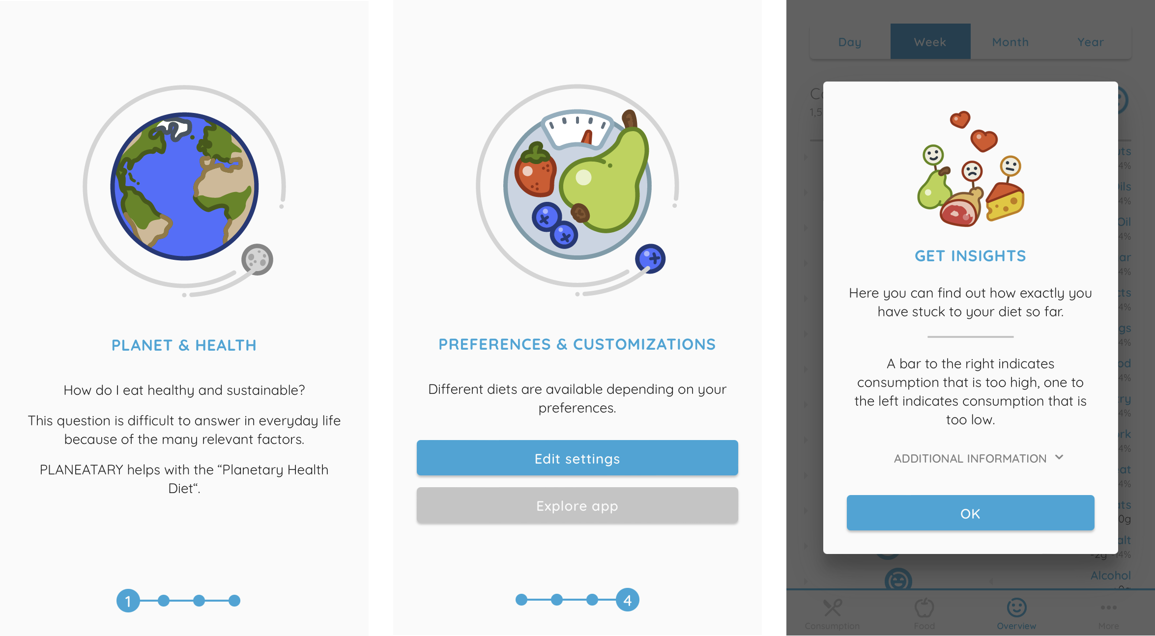
Intro into the App - onboarding screens and popups inside the app.
We deliberately decided against an extensive onboarding during the initial download (where the calories can be calculated and the plan set), because the app can work well with defaults and we suspect that many users are overwhelmed by having to make so many settings before the app can be used. But in our usability test showed that the app wasnʼt understood so we decided to include a short intro when first using the app. When first opening the app there are four screens with a graphic and text. In the last screen there are two options “Edit settings” (leads to the “More” screen) and “Explore app”. While exploring the app for the first time, more popups are displayed to explain the functionality.
When we created Planeatary, I was still in the middle of my bachelor studies and inexperienced — it was the first project on this scale I had ever worked on. I learned a lot and some things I would do differently today. Just to give a few examples: I would start testing earlier — before development preferably with one of the first prototypes. I would probably also brainstorm more and evaluate different solutions in the conception phase, maybe try Design Thinking on the problem. But overall, Planeatary is a successful project from my point of view — especially for something that the two of us created on the side in our spare time on a low budget of time and money. I was able to learn a lot and I would do a lot of it the same way again.

Conducting an eye-tracking study to investigate the usability of common types of cookie notices, and designed a prototype for better usability.

The User Insights Knowledge Base project tackles the challenges of limited user contact and knowledge sharing at Digitec GmbH.
Get in touch for opportunities or just to say hi!