Creating the App Planeatary for a Sustainable and Healthy Diet
Planeatary is a mobile app designing to support users to follow a healthy and environmentally friendly diet.
UX Design
FrontEnd Development
Mobile


D3 Sheets is a pricing engine for foreign exchange trading by Digitec GmbH. I worked for several years as a product designer for Digitec and in this project we aimed to improve the usability of the handling of critical states. This is an essential feature for FX traders to monitor their live prices and to get notified about bad prices early on.
July 2020 ➙ October 2020
The Status feature is one of the most important features of D3 Sheets software, as it protects users from high losses due to wrong/off-market prices. The goal of the project was to make the use of the feature more intuitive and to support users at different points of their user journey.
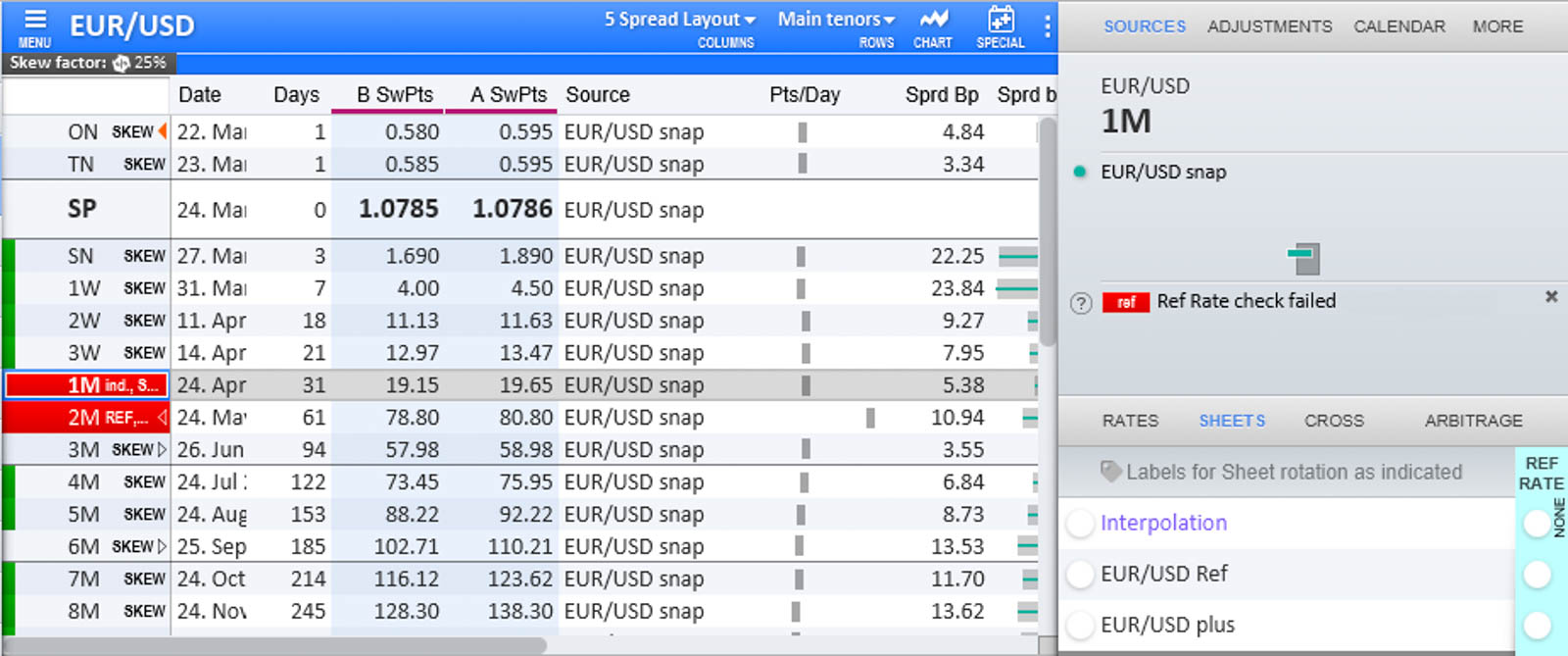
States in D3 are valuable hints that a price is off-market. They are e.g. determined by reference prices - as well as a few other internal calculations -, if the exported price and the reference price are far apart, a reference price alarm (status) is set. In the UI states are indicated in different places by color (traffic lights metaphor) as well as labels. If a price has a “red status” the price will not be published and therefore no automatic trades can happen on this price.

A lot of emails from our customers in the support hotline indicated that they are facing problems with the usability of the status feature. In our User Insights Knowledge base, the emails were derived to the following opportunities:
Like the second opportunity shows, the status feature can be especially complicated due to the often complex curve models customers build with the software. Curves are often interdependent (prices are “inherited” from one curve or calculated from multiple curves). In addition, prices on special dates are often interpolated from standard dates, making some prices dependent on prices on other dates. For users it was not currently apparent where the root of the problem lies, i.e. where they must rectify the status. For this, they may need to have a precise understanding of the selected curve model and the links between the curves in this model - which is usually not the case.
The status feature in the Sheet before the implementation of the project.
Before doing any usability improvements, the red color in the “Maturity” column showed that a price is off-market, additionally there were different short labels indicating the status. In the fixed sidebox on the right the “Critical States” display could be opened to show additional information - this was only visible in certain stages of the sidebox.
Furthermore, there is a so-called “Sheet Monitor” in the GUI, where different curves can be added. There, the status is also displayed by color and labels and thus the status can be seen even if the Sheet for the curve is not open.
To delve deeper into the existing customer problems and find possible solutions, a design sprint was conducted with five participants from product management, client support and development.

Screenshot of the Miro Board we used to do the workshop.
In the first phase of the Design Sprint we did several exercises to map the problem. In the first exercise two experts on the user problem (two colleagues from product management and client support that are in close contact with the users) talked about the problem and were asked questions. During the interview all the other participants wrote down so-called “How Might We (HMW) Statements”. Afterwards a Long Term Goal, as well as Sprint Questions was determined via brainstorming and dot-voting. While the goal takes a more positive view, the Sprint Questions task takes a pessimistic view of the problem to identify possible obstacles.
In the last task of the map phase, a user journey map was drawn:
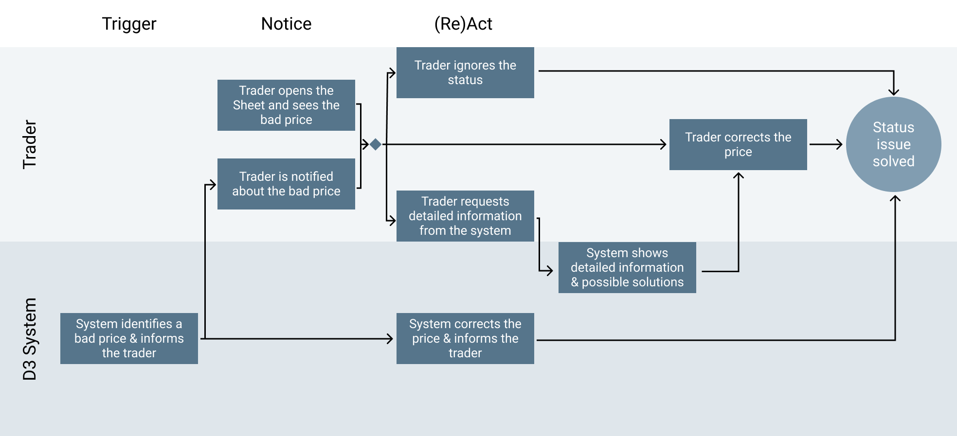
After drawing the map we decided to focus the workshop on the “Notice” phase as well as providing the users with additional information/ help to solve the status issue.
The ideate phase started with an exercise called “Lightning Demos”, where each participant gets a short amount of time to search for related features or solutions by competitors. Since the D3 software is a niche product and we didnʼt have access to the software of competitors we searched in software we often use as well as the internet for comparable features.

A screenshot of a few of the lightning demos provided by the participants.
As “homework” after this first workshop day, the participants were given the task to think of a solution for the problem in individual work and to prepare it visually (the aim was to make it self explanatory for the next workshop session).
On the second day of the workshop we had a look at all the solutions the different participants provided. We then did a dot-voting on the solutions and parts of them and stitched together a final solution.
The final solution was created in the form of storyboards based on the user journey. After the workshop, I put designs for the individual parts of the solutions in Adobe XD and wrote tickets for the software development. So far, not all parts of the solution have been implemented.
Since users sometimes run D3 Sheets in the background or have up to 6 different screens with different software open, itʼs essential to catch the users attention if a price turns bad. One feature that was already present for that is the Sheet Monitor, that was already described above. In the Sheet Monitor a Sheet would turn from green to red and display a short label with the Status. The Sheet Monitor is individually configurable per user and contains the whole set of Sheets that is of importance for the user, therefore this is already sufficient. In our solution, we decided to enhance this feature to better notify the user. If a Sheet in the Sheet Monitor of a user goes from green to red:

A screenshot of the Sheet Monitor feature. In the tile on the left, the sound can be turned on and off.
The app logo in the taskbar, like described above it will change between the blue (on the left) and orange (on the right).
The originally envisioned final solution also included two other ideas that have not yet been implemented (for time and prioritization constraints). The first one was creating the opportunity to fix the Sheet Monitor on the monitor if the rest of the software is minimized. This arised from the fact that most of our users have D3 running in the background, but the Sheet Monitor is supposed to be a watchlist and therefore could be helpful to still be displayed.
The second idea is a "Notifier Bell" that should also have worked as a to-do list - this was part of my proposed solution idea. The bell is located on the Sheet Monitor and would therefore always be visible with a minimized software, when the Monitor is fixated. The following User Journey was designed for this feature:
Using the Sheet Monitor Feature a user can simply click on a red Sheet to open it. The prices that are wrong are marked by red color and labels. The bigger issue is to find out why a price is wrong. In the past there was a view in the Sidebox called “Critical States”, in the new solution this view was extracted from the sidebox and put into a popup to be closer to the actual problem. Additionally it was enhanced by a Deep Link feature: if a status was not caused by the currently selected row, but is inherited (from another Curve or another date) a link to this price is provided.
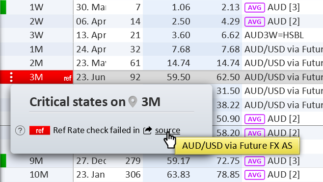
If the Deep Link is clicked the system identifies the root of the problem and:
The latter case works over several levels, so if e.g. Sheet A inherits a status to Sheet B and Sheet B is used by Sheet C, where the user finds the wrong price, the Deep Link will lead them directly to Sheet A - the root cause of the wrong price. The theoretical possibility that two root curves might cause a red status that is inherited is solved by displaying multiple Status rows in the popup in this case.

Planeatary is a mobile app designing to support users to follow a healthy and environmentally friendly diet.

CONSCIOUS.CHOICE is an e-commerce platform visualizing sustainability in fashion products that allows users to make sustainable decisions.
Get in touch for opportunities or just to say hi!